Creating your own controls
In the world of Delphi there are two archetypal programmers: Those that stick to the high level interface of Delphi, meaning that they only use pre-made controls and rarely go beneath the bonnet – and the second group which create components, packages and love to fiddle around with low-level coding. This type of stereotyping is something more or less unique to RAD languages (which would include Delphi, Lazarus, Visual Basic, Real Basic and languages that are “design” based). In more mature languages like C++, Delphi (yes Delphi is just as low level as the C++) or C# low-level work is almost unavoidable.
With Smart Mobile Studio we have tried to retain much of the high level abstraction you would expect from Delphi, but sadly the HTML5 platform is not as feature rich as the windows API. So the system demands that if you want something unique, you have to create your own controls in order to stand out. If not, you might as well go with the many template-based “app machines” out there that produce programs that all look and feel the same.
The basics of a control
There are two types of controls you can create under OP4JS: Graphical controls and ordinary parent/child controls (like you are used to from Delphi). A graphical control is an object that contains a HTML5 graphics context and canvas, which means you have to draw it yourself. This is good for things like games, charts or anything that cant be represented using “normal” html.
The second type, which is the one 90% of all the standard controls that ship with Smart Mobile Studio derive from, is TW3CustomControl. So let’s have a look at how setting up a fancy iPhone header looks like:
type

TW3HeaderControl = Class(TW3CustomControl)
private
  FLabel:     TW3Label;
  FBackBtn:   TW3ToolButton;
  FNextBtn:   TW3ToolButton;
Protected
  Procedure   Resize;Override;
protected
  Procedure   InitializeObject;override;
  Procedure   FinalizeObject;override;
  Procedure   StyleTagObject;override;
End;
Under Delphi you would probably expect to see a constructor and destructor in the above code, but under OP4JS we try to synchronize the number of steps taken to establish a control (i.e number of resize and position operations). So to solve this we have introduced 3 new methods: InitializeObject, FinalizeObject and StyleTagObject. As the names imply you create any sub-controls and initialize your variables in InitializeObject (just think of it as your constructor), you destroy those instances in FinalizeObject, and you apply any extra styling or property alteration in the StyleTagObject method.
Clever styling
When a control is in the state of creation, it automatically set it’s own style class (think html here) to the name of it’s class. So in order to give our little control a nice look – we edit the default style sheet (this is automatically created when you create a new application) and make it look like a true iPhone header. The rule of thumb is: The name of the CSS class always matches the name of the OP4JS control:
.TW3HeaderControl
{
	background-image:-webkit-gradient(linear, left top, left bottom,
		from(#b2bbca),
		color-stop(0.25, #a7b0c3),
		color-stop(0.5, #909cb3),
		color-stop(0.5, #8593ac),
		color-stop(0.75, #7c8ba5),
		to(#73839f));
	border-top: 1px solid #cdd5df;
	border-bottom: 1px solid #2d3642;
	-webkit-box-shadow: rgba(33, 33, 33, 0.2) 0px 1px 1px;
}
Adding behavior
If you don’t know anything about CSS or HTML, don’t worry, you can always copy a style you like from the default skin, and there are plenty of examples around the Internet to learn from (or just get a good book, that would save you a lot of time). OK now we need to add some code to our unit to make it come alive:
Procedure TW3HeaderControl.InitializeObject;
Begin
  inherited;
  FLabel:=TW3Label.Create(self);
  FLabel.BorderStyle:=bsDotted;
end;

Procedure TW3HeaderControl.FinalizeObject;
Begin
  FLabel.free;

  if assigned(FBackBtn) then
  FBackBtn.free;

  if assigned(FNextBtn) then
  FNextBtn.free;

  inherited;
end;

Procedure TW3HeaderControl.StyleTagObject;
Begin
  inherited StyleTagObject;
end;

Procedure TW3HeaderControl.Resize;
var
  wd,hd:  Integer;
  mTemp:  Integer;
  dx:     Integer;
Begin
  wd:=Width;
  hd:=Height;

  mTemp:=wd;
  dx:=4;
  dec(mTemp,4); //left margin
  dec(mTemp,4); //Right margin

  if  assigned(FBackBtn)
  and (FBackBtn.Visible) then
  Begin
    //space between "back" & label
    dec(mTemp,FBackBtn.width);
    dec(mTemp,2);

    //offset the left edge of the label
    inc(dx,FBackBtn.Width);
    inc(dx,2);

    // position the back-button
    FBackBtn.Left:=4;
    FBackBtn.Top:=4;
  end;

  if  assigned(FNextBtn)
  and (FNextBtn.Visible) then
  Begin
    //space between label & "next" button
    dec(mTemp,FNextBtn.width);
    dec(mTemp,2);
    FNextBtn.Left:=mTemp;
    FNextBtn.Top:=4;
  end;

  FLabel.left:=dx;
  FLabel.top:=4;
  FLabel.Width:=mTemp;
  FLabel.Height:=Height-8;
end;
Why all that code? First of all because a typical iPhone header have 3 parts: A back button, a next button and some text in the middle. The above code checks to see if you actually have created a back or next button and shrinks the text area accordingly. Let’s see how it looks so far:
I have set the label to have a dotted frame just to make it easier to work with, we will of-course remove the frame all together later. But now, let’s add some more methods to the class interface. We want to expose the label object to give the user access to it’s full capabilities (caption, font, background, orientation and all the rest), and we also want both back and next buttons.
But, we want to keep resources to a bare minimum, so we will use the old “need” trick and only create the buttons when asked for. So the buttons will only be created when you access them:
TW3HeaderControl = Class(TW3CustomControl)
private
  FLabel:     TW3Label;
  FBackBtn:   TW3ToolButton;
  FNextBtn:   TW3ToolButton;
  procedure   ReleaseButtons;
  Procedure   NeedBackButton;
  Procedure   NeedNextButton;
  function    getBackButton:TW3ToolButton;
  function    getNextButton:TW3ToolButton;
Protected
  Procedure   Resize;Override;
protected
  Procedure   InitializeObject;override;
  Procedure   FinalizeObject;override;
  Procedure   StyleTagObject;override;
public
  Property    BackButton:TW3ToolButton read getBackButton;
  Property    NextButton:TW3ToolButton read getNextButton;
  property    Title:TW3Label read FLabel;
  Property    Options:TW3HeaderButtonOptions
              read FOptions write setOptions;
End;
And the implementation for our new methods are (this is just a quick example):
Procedure TW3HeaderControl.NeedBackButton;
Begin
  // Create object on the fly if required
  if not assigned(FBackBtn) then
  Begin
    BeginUpdate;
    FBackBtn:=TW3ToolButton.Create(Self);
    SetReSized;
    EndUpdate;
  end;
end;

Procedure TW3HeaderControl.NeedNextButton;
Begin
  // Create object on the fly if required
  if not assigned(FNextbtn) then
  Begin
    BeginUpdate;
    FNextbtn:=TW3ToolButton.Create(Self);
    SetReSized;
    EndUpdate;
  end;
end;

function TW3HeaderControl.getBackButton:TW3ToolButton;
Begin
  NeedBackButton;
  result:=FBackBtn;
end;

function TW3HeaderControl.getNextButton:TW3ToolButton;
Begin
  NeedNextButton;
  result:=FNextBtn;
end;

procedure TW3HeaderControl.ReleaseButtons;
Begin
  if assigned(FBackBtn) then
  Begin
    FBackBtn.free;
    FBackBtn:=NIL;
  end;

  if assigned(FBackBtn) then
  Begin
    FNextBtn.free;
    FNextBtn:=NIL;
  end;
end;
The final product
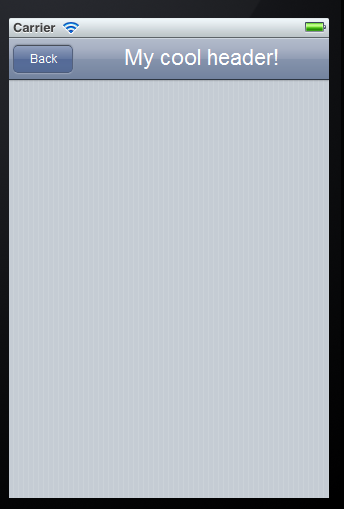
To use our new control, all we have to write (in our Form’s InitializeObject for instance) is something like:
FMyCoolHeader:=TW3HeaderControl.Create(self);
FMyCoolHeader.BackButton.Caption:='Back';
FMyCoolHeader.BackButton.onClick:=HandleBackButtonClicked;
FMyCoolHeader.Title.Caption:='My cool header!';
And voila – we have a nifty iPhone header that looks and feels like the real thing 🙂
Further reading
The easiest way to learn is to look at the unit w3ctrls.pas in the RTL folder. The controls there all inherit from TW3CustomControl and range from very simple to very complex.


